
Revamping Enfant Terrible’s Website
Enfant Terrible is a cooperative media outlet founded in 2018 in Córdoba, Argentina. Its focus covers socio-environmental, political, territorial, and gender issues, working in collaboration with social organizations and as a founding member of the Red de Medios Digitales (RMD) de Argentina.
TL;DR
Challenge
The site no longer reflected the evolving brand identity, leading to usability issues and disconnects with user expectations.
Process
Conducted user interviews, reviewed website analytics, and collaborated with the Editorial team to identify key pain points.
Solution
Redesigned the website from the ground up—improving navigation, introducing live search, and modernizing the visual layout—to better align with the brand’s identity.
Impact
Delivered a cohesive online presence with improved usability and enhanced user engagement.
Role
Functional Analyst, Web Developer, UX/UI Designer
Stack
WordPress, Oxygen, Gutenberg, Tailwind, Winden
What I did
As the lead designer, developer, and functional analyst, I led the exploration, analysis, design, and implementation of the Enfant Terrible website.
I conducted internal and external interviews to define business and user requirements and translated those needs into site functionality.
I defined key features, behaviors, and integrations, ensuring seamless integration with WordPress and third-party services.
Additionally, I developed low- and high-fidelity prototypes to refine the user experience and handled the full implementation in WordPress.
The Problem
Enfant Terrible went through several processes of maturation of its visual identity since its foundation.
Given the emphasis on social media, with particular growth on Instagram, the speed at which the visual identity matured was not the same as that of the website.
Many components of the site no longer represented the visual identity of Enfant Terrible, while others had usability issues.
Goal
Implement a redesign of the Enfant Terrible website that is consistent with its current visual identity.
Research
I held meetings with the Enfant Terrible team to identify problems and potential improvements.
I considered the web platform and social media as a family of interconnected products and conducted a heuristic analysis to evaluate internal visual consistency.
I analyzed data from Google Analytics and Microsoft Clarity to better understand consumption and interaction patterns with the website.
I conducted interviews with 6 regular users to delve into how they consume content on the web platform, as well as the problems or issues they frequently encounter.
Insights
Visual Analysis
The typography and visual styles presented on social media did not match those on the website. Some components had accessibility issues.
Home
Users coming from Instagram preferred to have more content on the homepage.
Search
All interviewed users had problems with the website’s search function.
Context
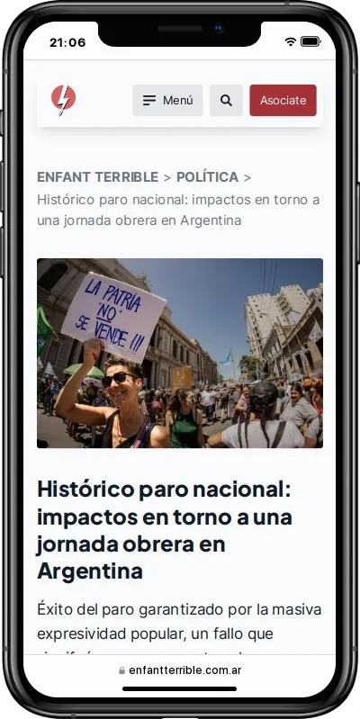
Users rely on the tagline/lead to quickly understand the context of the articles.
Process
Taking into account what was raised by the Enfant Terrible team, along with the insights gathered from the interviews and analytics, key elements were identified:
- Design a single source of truth that allows for maintaining internal consistency across different products.
- Improve the layout of articles on the homepage.
- Implement a better search system.
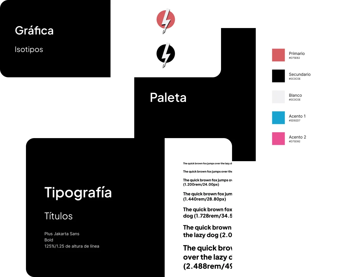
Single Source of Truth
I created a style and brand guide in Figma to guide the redesign process. This guide served both for the web redesign and for improving the asset generation workflow for social media by the Community Management team.
Home (is where I want to be)
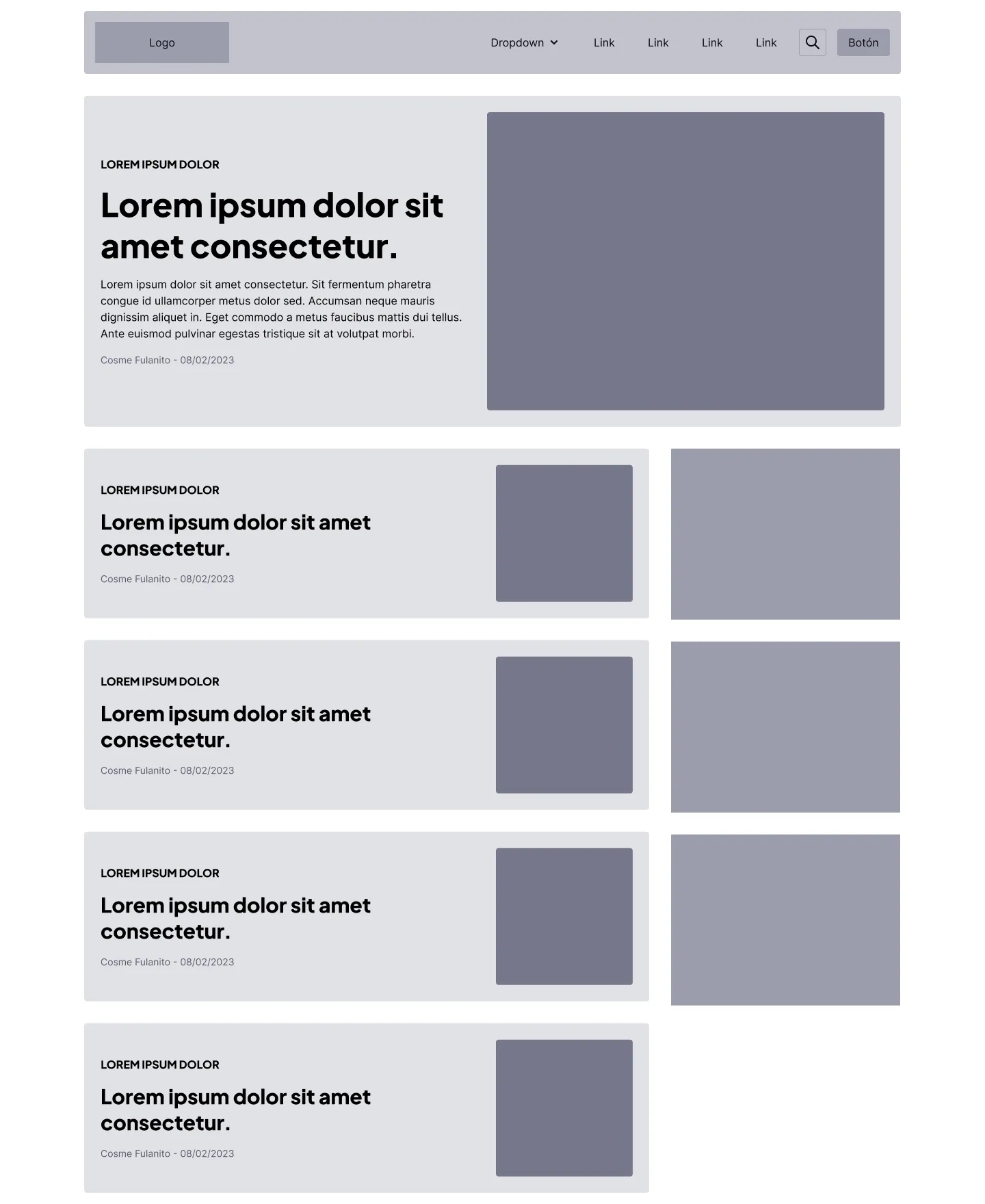
Once the style and brand guide was systematized, we proceeded to iterate over a series of wireframes. Special attention was given to the homepage and the articles themselves, as these were the most common access points according to Analytics and the information gathered from the interviews.
We had several ideation sessions with the Enfant Terrible team, where I presented some usability and accessibility issues with the website. We worked for several weeks on the layout of the homepage and the articles.
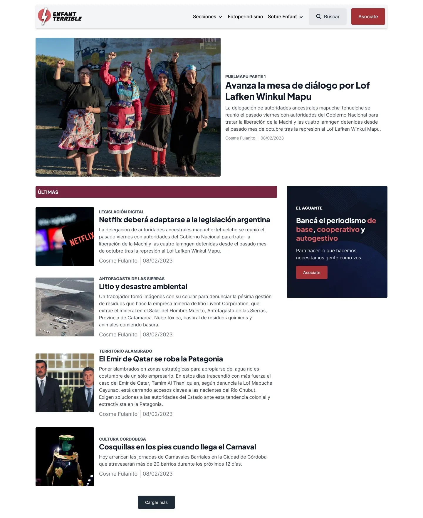
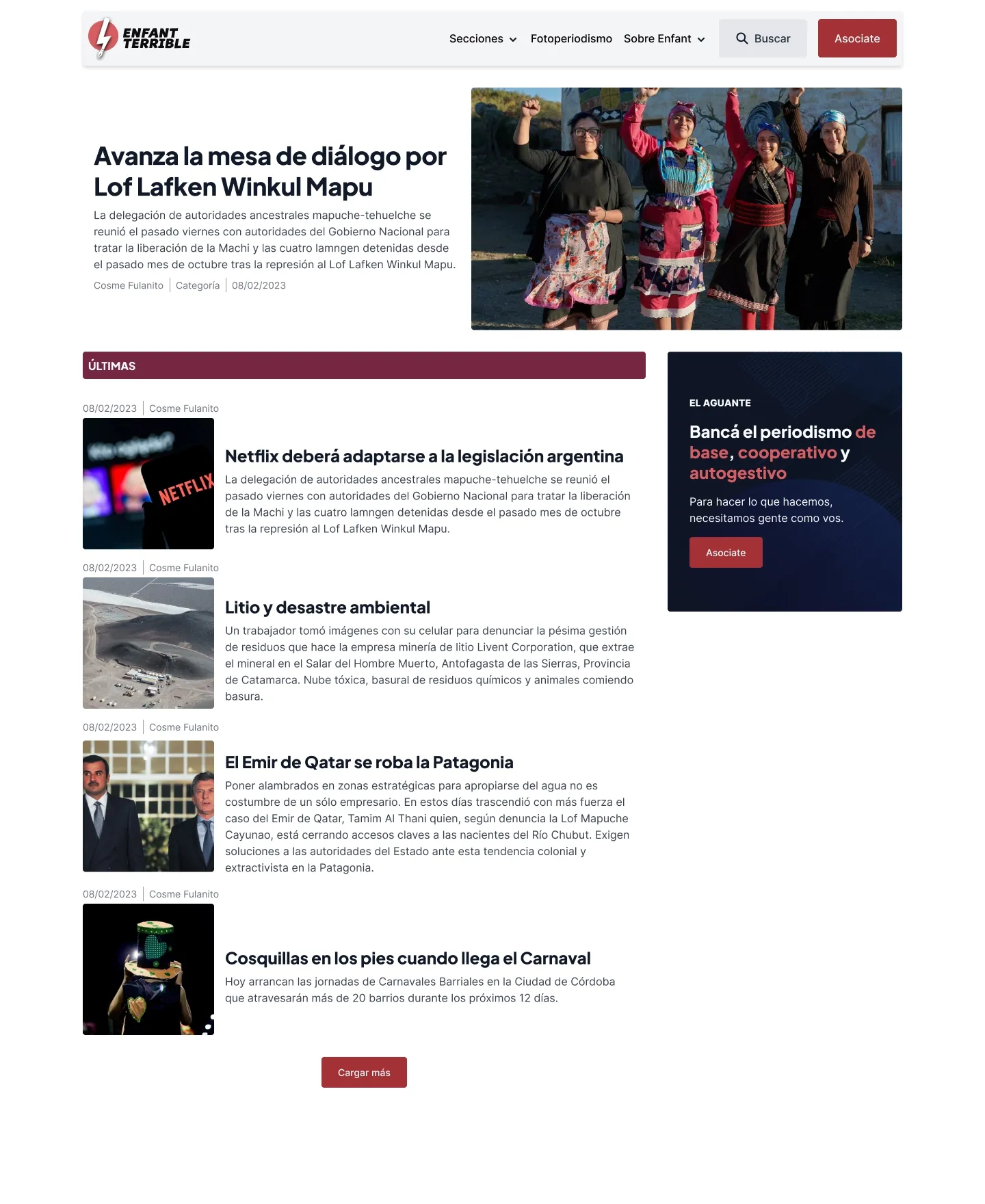
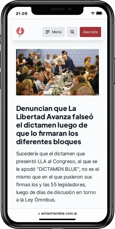
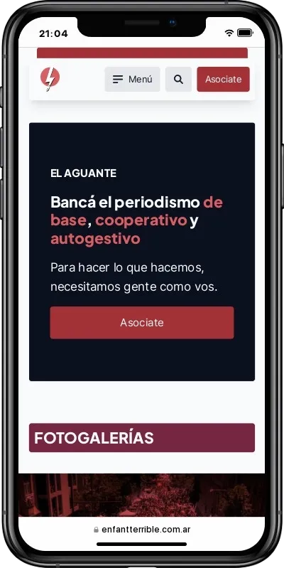
A feed of articles was implemented, prioritizing more compact content, with as much information as possible in each article, moving certain details (authorship, category, date) to the background.
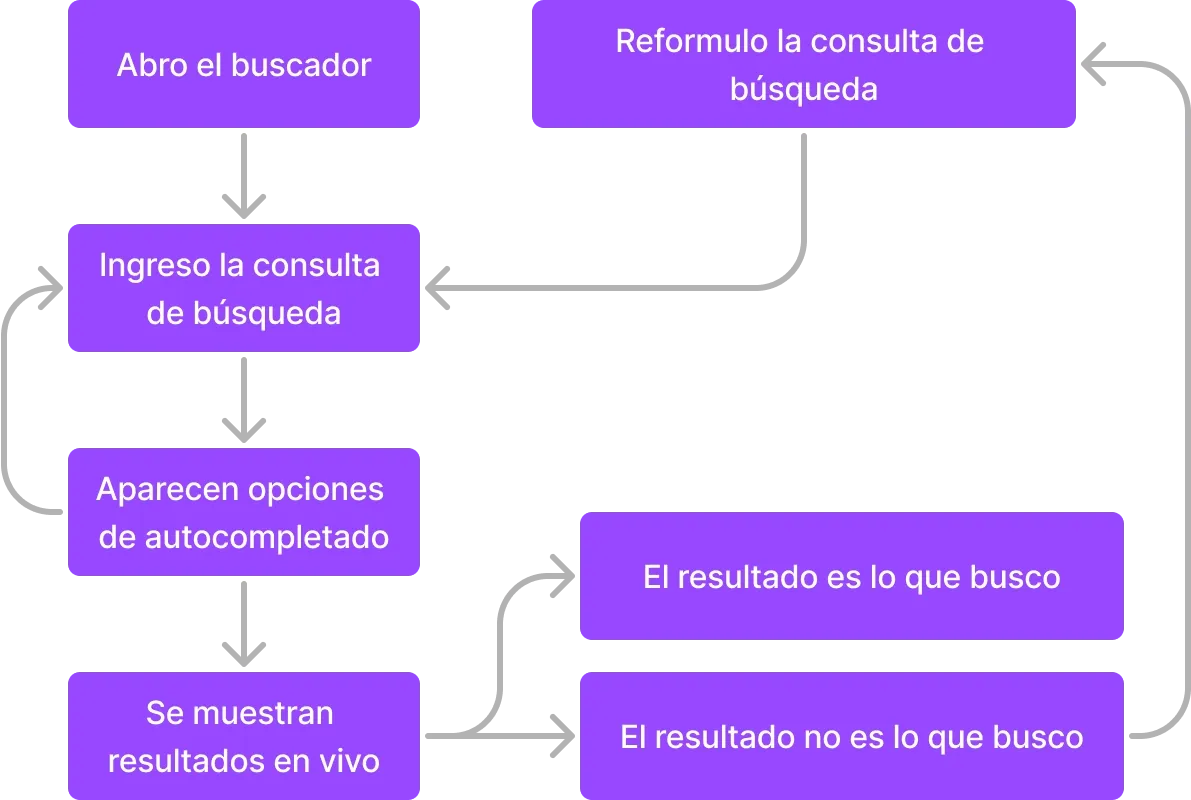
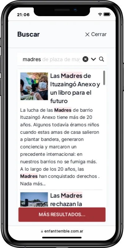
Improving the Search
One of the issues mentioned by the interviewed users was how cumbersome it was to search for an article when they didn’t know how to phrase their search. The system didn’t provide any status notifications until after the search had been made.
To ease the search process, a flow was designed that provided live search with autocomplete options, reducing the number of interactions and providing search status notifications.
Takeaways
The project is written in a logical order, not a chronological one.
Certain stages were challenging due to limited resources. As the sole designer and developer, the process was longer and less comprehensive than I would have liked.
Despite this, the redesign received positive feedback, both within Enfant Terrible and from external users, even beyond the sample used to evaluate the implementation.
Although Enfant Terrible’s visual identity has developed over the last few years, there are still things to resolve.
Currently, the website is built using Oxygen, a visual builder, and Winden, an extension that allows the use of Tailwind.
The decision to do it this way is because the website itself is at a turning point, with a planned migration to a hybrid theme with Tailwind.
Oxygen and Winden turned out to be an intermediate step, with the former being part of the site’s technical debt.